I worked with the team at WeDoCo’s studio to design the brand for BCS, a global authority in managing data centres and critical infrastructure projects. Their existing brand no longer captured the company’s scale or forward-looking vision, so following several workshops and creative sessions with the client, we created a new visual identity for the brand. The result is bold and modern, complete with a refined logo and a clear, confident tone of voice that reflects a people-driven organisation focused on accuracy and advancement.
© All BCS work was carried out at WeDoCo.
For 35 years AVK has powered mission-critical systems, but with data centres driving massive energy demand it refocused on this thriving sector. A full rebrand gave AVK a modern, user-friendly identity that tells a clear story across all channels, strengthening both market presence and culture.
View video here
© All AVK work was carried out at We-Do-Co.
Talent Solutions empowers careers and transforms workforces by partnering with organisations to attract and develop talent. The refreshed global identity, designed for flexibility and connection, uses a unifying graphic device and layered toolkit to help teams worldwide create dynamic, meaningful communications.
View video here
© All Talent Solutions work was carried out at We-Do-Co.
The HTC Global Services brand speaks of continuous transformation, with a logo and typographic system which is always on the move. Built on a robust, solid design system, networks of elements can effortlessly shift and change. With a dynamic, perpetually reforming logo it’s modular nature symbolises adaptability.
View video here
© All HTC Global Services work was carried out at Conran Design Group.
The identity for this global mining company is inspired by the line ‘built from the core’, a visual language that draws Glencore’s audience in and highlights their point of difference, focuses attention on the benefits they bring, and helps to make a connection between what they do and the products people enjoy everyday.
© All Glencore work was carried out at Conran Design Group.
Conceived and designed during the COVID-19 lockdown, this is a personal project with the aim to bring to life the great American bus brand: Greyhound Lines, built around the core thought of ‘Uniting States’. This thought and it’s visual application are presented across a number of different channels.
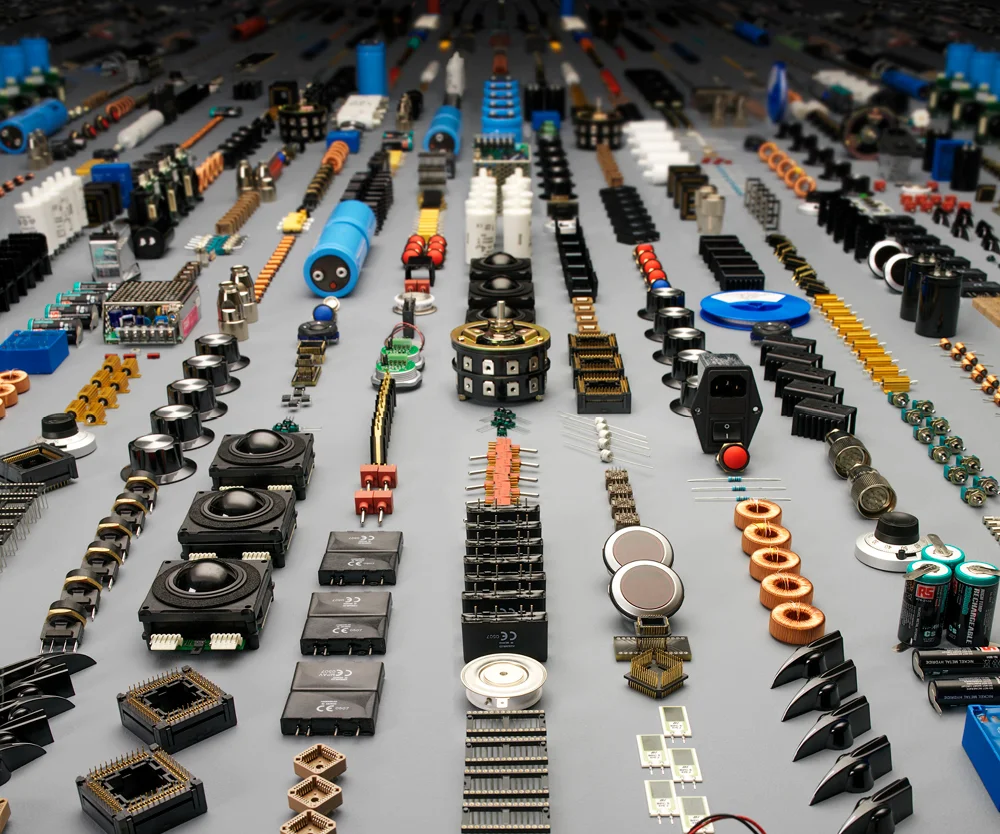
The goal was to reposition this electronics and industrial products provider from a distributor to a value-added, customer-focused partner. The narrative, themed ‘Becoming first choice’, was supported by bold design, innovation stories, and clear information design that delivers a strong overview and fast read of the investment case.
© All Electrocomponents work was carried out at Conran Design Group
Design of the Pets at Home (the UK's largest pet shop) Annual Report brought full recognition to the Group’s mission of becoming ‘the best pet shop in the world’.
Work undertaken included art direction of photoshoot, full understanding and interpretation of the Group's business model and mission and overall design of the brochure which includes detailed infographics.
© All Pets at Home work was carried out at SampsonMay.
The focus of work for this global pharmaceutical business was primarily on data visualisation and infographics, several of which were translated into short animation pieces. Also, brochure design, specifically the Code of Conduct, a six month project which took in workshops, photoshoots, icons and brochure design. This publication appeared in over 20 translations.
© All GSK work was carried out at SampsonMay.
Look and feel for the Johnson Matthey (global leader in sustainable technologies) Code of Conduct. Based around the idea of 'building blocks of our business' this execution uses icon style illustrations alongside simple overlays. The idea was translated across a number of different channels both printed and digital.
© All Johnson Matthey work was carried out at SampsonMay.
Advent are a specialist insurance underwriting group. We undertook a redesign of their primary office branding: glass wall maps, prints, signage, wayfinding and naming conventions. Other work included design of brochures and art direction of photoshoots.
© All Advent work was carried out at SampsonMay.
Design and illustration of the RR calendar, assembling all montage elements to create dynamic compositions representing the breadth of this enormous company.
Also, a full campaign for their health and safety scheme, which included over thirty separate graphic poster illustrations devised to encourage employee involvement in the work place.
© All Rolls-Royce work was carried out at SampsonMay.